Title: Looking For Feedback...
Post by: AMPM on August 24, 2013, 03:27:03 AM
Post by: AMPM on August 24, 2013, 03:27:03 AM
So, I showed a couple of clocks my new comic, and I got a lot of feed back on it, and as I'm going to be doing a total re-draw of the full 22 page long beast, I really want to get as much feedback as possible, and because one of the clocks I spoke to encouraged me to post it online, I thought I would, and hope that some of you take the time to give it a look and then let me know what you think of it: Good, hopefully, or Bad, preferably, because I really do want to hammer out as many kinks or have options illuminated to me before I go onto another draft.
http://inthenoweventually.thecomicseries.com/comics/1/
http://inthenoweventually.thecomicseries.com/comics/1/
Title: Looking For Feedback...
Post by: CandleJack on August 24, 2013, 03:45:46 AM
Post by: CandleJack on August 24, 2013, 03:45:46 AM
Quote from: BrainsnailClock;1958425So, I showed a couple of clocks my new comic, and I got a lot of feed back on it, and as I'm going to be doing a total re-draw of the full 22 page long beast, I really want to get as much feedback as possible, and because one of the clocks I spoke to encouraged me to post it online, I thought I would, and hope that some of you take the time to give it a look and then let me know what you think of it: Good, hopefully, or Bad, preferably, because I really do want to hammer out as many kinks or have options illuminated to me before I go onto another draft.
http://inthenoweventually.thecomicseries.com/comics/1/
It is difficult to read the flat black and white make it hard. it has a style about it. only time will tell. i tried running a webcomic for the CC years and years back Called Clock Comix it was a fairly well built website and i was doing it with another clock. it was gonna be mainly updated 2 days a week. and 2 days at random by anyone who wanted to submit a comic. It didn't take off sadly. Understand that a web comic is a lot of hard work with very little initial pay off. Rarely does a web comic get popular all at once and start generating revenue.
a few tips.
- it needs to be smooth and easy to read
- a clear direction and relatable humor
- artwork isn't always terribly important but contrast in the artwork (shades of black white grey) don't be lazy!
- listen to your readers. don't let them hold you hostage but take what they have to say and take it into consideration.
-
Title: Looking For Feedback...
Post by: AMPM on August 24, 2013, 03:50:32 AM
Post by: AMPM on August 24, 2013, 03:50:32 AM
Well what do you mean by "flat black and white"? besides that I understand and agree with everything you said
Title: Looking For Feedback...
Post by: CandleJack on August 24, 2013, 03:54:01 AM
Post by: CandleJack on August 24, 2013, 03:54:01 AM
Quote from: BrainsnailClock;1958427Well what do you mean by "flat black and white"? besides that I understand and agree with everything you saidthe fact that it looks like it was ink screened black on white makes it very difficult to read and see whats doing on. consider using shading and going gray scale. it almost looks like a mess of scribbles and blobs, unless you look at it really close.
Title: Looking For Feedback...
Post by: VCRClock on August 24, 2013, 03:58:04 AM
Post by: VCRClock on August 24, 2013, 03:58:04 AM
Cool. I like the style, the rough edges, and your interesting, lively choice of perspective on a lot of the panels. There's probably some other good stuff I'm not even thinking about right now.
If I were to choose one suggestion to make, without really being able to demonstrate how to implement it in your work, it would be this: in panels where there's a lot going on, consider using value to separate the background from the figures in the foreground. I think of this because I've been reading a lot of black and white Krazy Kat strips lately, and noticing that George Herriman is really good at doing that (among other things). Here's one example (http://www.comicstriplibrary.org/images/comics/krazy-kat/krazy-kat-19160806-l.png), though by no means is that the only or best example of what I'm talking about. I'm tired ok
If I were to choose one suggestion to make, without really being able to demonstrate how to implement it in your work, it would be this: in panels where there's a lot going on, consider using value to separate the background from the figures in the foreground. I think of this because I've been reading a lot of black and white Krazy Kat strips lately, and noticing that George Herriman is really good at doing that (among other things). Here's one example (http://www.comicstriplibrary.org/images/comics/krazy-kat/krazy-kat-19160806-l.png), though by no means is that the only or best example of what I'm talking about. I'm tired ok
Title: Looking For Feedback...
Post by: CandleJack on August 24, 2013, 04:03:03 AM
Post by: CandleJack on August 24, 2013, 04:03:03 AM
Quote from: VCRClock;1958430Cool. I like the style, the rough edges, and your interesting, lively choice of perspective on a lot of the panels. There's probably some other good stuff I'm not even thinking about right now.
If I were to choose one suggestion to make, without really being able to demonstrate how to implement it in your work, it would be this: in panels where there's a lot going on, consider using value to separate the background from the figures in the foreground. I think of this because I've been reading a lot of black and white Krazy Kat strips lately, and noticing that George Herriman is really good at doing that (among other things). Here's one example, though by no means is that the only or best example of what I'm talking about. I'm tired ok
see his example actually gives you another option if you open up the size of your cells and make it less cluttered would help a lot too.
Title: Looking For Feedback...
Post by: AMPM on August 24, 2013, 04:04:20 AM
Post by: AMPM on August 24, 2013, 04:04:20 AM
Yeah, I've actually been told it looks like my characters aren't in the environments but floating in front of them, but they didn't have anyway of solving that either, necessarily. And yeah I'm not quite sure, looking at this krazy kat comic, which I always forget exists but then I see it and I'm like, wow this is amazing, but yeah, I don't really see what he's doing there to make his backgrounds backgroundy besides be a better artist than me, I got no specifics.
Title: Looking For Feedback...
Post by: AMPM on August 24, 2013, 04:05:19 AM
Post by: AMPM on August 24, 2013, 04:05:19 AM
Quote from: CandleJack;1958433see his example actually gives you another option if you open up the size of your cells and make it less cluttered would help a lot too.
Yeah in the redraw I hope to really make good use of my panels and use of word balloons, i'm gonna be drawing on larger paper so that should help.
Title: Looking For Feedback...
Post by: CandleJack on August 24, 2013, 04:10:51 AM
Post by: CandleJack on August 24, 2013, 04:10:51 AM
Quote from: BrainsnailClock;1958435Yeah in the redraw I hope to really make good use of my panels and use of word balloons, i'm gonna be drawing on larger paper so that should help.
open less cluttered frame will do a world of difference your style on the eyes is good i see them looking where they should.
Title: Looking For Feedback...
Post by: VCRClock on August 24, 2013, 04:29:00 AM
Post by: VCRClock on August 24, 2013, 04:29:00 AM
I don't even mean to draw attention to his draftsmanship. He's got a totally different style going on there.
I guess the simplest example of using value to separate figure and ground is in panels 5, 6 and 7. It's pitch dark and stuff so he can get away with using solid black for the house. Key objects like the barrel, the window and the characters are mostly white. They stand out, so they're easy to focus on. But even if you look at the left side of the panel where Offisa Pupp is peeking around the corner... it's night, so there's gotta be a dark sky, and it can't be black, or it'd blend in with the house. The lines are kind of busy, though, and Pupp stands out better on that field of pure white surrounding him than he would if that darkness were surrounding or bisecting him.
In panels 8-9, I think the dark wainscoting between the wall in the floor is a big deal. In 8, it's a point of contrast for the white jacket and white wall. If it were white, too, it might just look like skinny black pen lines extending from the jacket. The skinny lines on the floor also help us to feel like the floor is "there", but really any texture would have worked. Note that he avoids distraction by not extending the wainscoting across the panel (because we're not really supposed to be looking at it) or causing visual confusion by connecting the dark wainscoting to the dark mousetrap. When Krazy takes off his jacket in panel 9, you can actually see that the wainscoting is shaded lighter as it gets closer to Krazy's body, for the same reason.
In the lower left of panel 10, he shades in the sides of the path just enough to provide some contrast and show you what kind of terrain it is, but not so much that it looks busy. The shading and even the line marking the left side of the path don't touch the outline of Pupp; they're not connected to each other, after all. And then there are the lines in the sky near the trees to provide just enough contrast to show that there is a sky and that the trees are not part of it.
TL;DR if you took all the shading lines out of Krazy Kat, or shaded it exactly as it might appear to a camera, it'd be flatter and less readable.
It's a technique thang, of course, and there are probably different ways of applying the same ideas. Just something to think about. I'm not telling you to be Herriman, and neither do I mean to suggest that I have any mastery of this skill.
I guess the simplest example of using value to separate figure and ground is in panels 5, 6 and 7. It's pitch dark and stuff so he can get away with using solid black for the house. Key objects like the barrel, the window and the characters are mostly white. They stand out, so they're easy to focus on. But even if you look at the left side of the panel where Offisa Pupp is peeking around the corner... it's night, so there's gotta be a dark sky, and it can't be black, or it'd blend in with the house. The lines are kind of busy, though, and Pupp stands out better on that field of pure white surrounding him than he would if that darkness were surrounding or bisecting him.
In panels 8-9, I think the dark wainscoting between the wall in the floor is a big deal. In 8, it's a point of contrast for the white jacket and white wall. If it were white, too, it might just look like skinny black pen lines extending from the jacket. The skinny lines on the floor also help us to feel like the floor is "there", but really any texture would have worked. Note that he avoids distraction by not extending the wainscoting across the panel (because we're not really supposed to be looking at it) or causing visual confusion by connecting the dark wainscoting to the dark mousetrap. When Krazy takes off his jacket in panel 9, you can actually see that the wainscoting is shaded lighter as it gets closer to Krazy's body, for the same reason.
In the lower left of panel 10, he shades in the sides of the path just enough to provide some contrast and show you what kind of terrain it is, but not so much that it looks busy. The shading and even the line marking the left side of the path don't touch the outline of Pupp; they're not connected to each other, after all. And then there are the lines in the sky near the trees to provide just enough contrast to show that there is a sky and that the trees are not part of it.
TL;DR if you took all the shading lines out of Krazy Kat, or shaded it exactly as it might appear to a camera, it'd be flatter and less readable.
It's a technique thang, of course, and there are probably different ways of applying the same ideas. Just something to think about. I'm not telling you to be Herriman, and neither do I mean to suggest that I have any mastery of this skill.
Title: Looking For Feedback...
Post by: AMPM on August 24, 2013, 04:47:43 AM
Post by: AMPM on August 24, 2013, 04:47:43 AM
Yeah, that was most certainly not tldr, those are really interesting points, and something I should remember when doing my panels, like you, I doubt I could reach that level of page design and panel layout but your points are really something good to think about.
I'm kind of taking my cues from Hate magazine's buddy bradley stores in a lot of ways, i think particularly in the backgrounds. And a lot of other things, but let's not point out how I'm a rip off artist.
I'm kind of taking my cues from Hate magazine's buddy bradley stores in a lot of ways, i think particularly in the backgrounds. And a lot of other things, but let's not point out how I'm a rip off artist.
Title: Looking For Feedback...
Post by: Slurpee on August 24, 2013, 05:06:51 AM
Post by: Slurpee on August 24, 2013, 05:06:51 AM
to be brutally honest, and I'm not trying to be a dick, here, but I almost stopped around the third panel of the first page, and probably would have if this was just something I stumbled across. your first major roadblock is going to be the lack of a hook.
don't get me wrong, once I read through it, I was a invested in ryland, and I like what you did, altogether, but I only read that far because you're a fellow clock and you're looking for feedback.
your first impression is critical. make an effort to get the reader curious about ryland; who he is and his situation. the alarm going off at 2 PM and still surprising and infuriating him is a great detail, but it's also something I didn't even notice in my first read. playing with your layouts and having some fun drawing attention to subtleties like that could go a long way.
the first page in particular also suffers from tell-not-show. it's not too terrible that he talks out loud to himself, but he does it extensively and in a way that feels rushed and at the expense of naturalistic timing. be aware of your medium- comics can use the spacing of illustrations to express the passage of time, amongst other things.
alan bursting in to find ryland pretending to practice should be funny and surprising but instead it was more confusing, and the punchline didn't hit as hard as it could have.
for one, so much happens in the first page so quickly that it's not immediately clear what the passage of time is like from one panel to the next, so alan's bursting in, and the speed at which ryland presumably fixed himself up, lose a lot of potential impact.
for another, the geography of what you're depicting is not immediately clear- in panel 2 on page 2, we're suddenly looking at a door, but it's not immediately clear where this door is in relation to anything we've seen before.
the left side of the door also forms a tangent line (http://schweizercomics.tumblr.com/post/11966164633/the-schweizer-guide-to-spotting-tangents) with the left side of the panel- it's actually not even immediately clear that panel 2 is a separate panel, making alan's sudden entry through the door in panel 3 feel a little bizarre and unclear.
much of the detail work is also changed between panel 2 and 3 on page 2. if you're illustrating an action taking place at a single location, consistency in depicting that location drives the impact the action- the third panel is wider, shifted slightly to the left, and the poster, floor molding, and mouse hole have all disappeared. it's commendable that you dynamically reposition the camera and redraw the backgrounds, but letting it be at the expense of visual continuity is to the comic's detriment-the reader is going to need some visual landmarks to properly follow the action.
the style is OK. the pages are a little large, but the stark hand-drawn style has its merits. there's something of the underground comix (http://en.wikipedia.org/wiki/Underground_comix) spirit in there, a fledgling of rebellion and flippancy toward traditional storytelling mores.
edit: apparently I took more than an hour to write this post for some reason and consequently I didn't read the rest of the thread before posting it.
don't get me wrong, once I read through it, I was a invested in ryland, and I like what you did, altogether, but I only read that far because you're a fellow clock and you're looking for feedback.
your first impression is critical. make an effort to get the reader curious about ryland; who he is and his situation. the alarm going off at 2 PM and still surprising and infuriating him is a great detail, but it's also something I didn't even notice in my first read. playing with your layouts and having some fun drawing attention to subtleties like that could go a long way.
the first page in particular also suffers from tell-not-show. it's not too terrible that he talks out loud to himself, but he does it extensively and in a way that feels rushed and at the expense of naturalistic timing. be aware of your medium- comics can use the spacing of illustrations to express the passage of time, amongst other things.
alan bursting in to find ryland pretending to practice should be funny and surprising but instead it was more confusing, and the punchline didn't hit as hard as it could have.
for one, so much happens in the first page so quickly that it's not immediately clear what the passage of time is like from one panel to the next, so alan's bursting in, and the speed at which ryland presumably fixed himself up, lose a lot of potential impact.
for another, the geography of what you're depicting is not immediately clear- in panel 2 on page 2, we're suddenly looking at a door, but it's not immediately clear where this door is in relation to anything we've seen before.
the left side of the door also forms a tangent line (http://schweizercomics.tumblr.com/post/11966164633/the-schweizer-guide-to-spotting-tangents) with the left side of the panel- it's actually not even immediately clear that panel 2 is a separate panel, making alan's sudden entry through the door in panel 3 feel a little bizarre and unclear.
much of the detail work is also changed between panel 2 and 3 on page 2. if you're illustrating an action taking place at a single location, consistency in depicting that location drives the impact the action- the third panel is wider, shifted slightly to the left, and the poster, floor molding, and mouse hole have all disappeared. it's commendable that you dynamically reposition the camera and redraw the backgrounds, but letting it be at the expense of visual continuity is to the comic's detriment-the reader is going to need some visual landmarks to properly follow the action.
the style is OK. the pages are a little large, but the stark hand-drawn style has its merits. there's something of the underground comix (http://en.wikipedia.org/wiki/Underground_comix) spirit in there, a fledgling of rebellion and flippancy toward traditional storytelling mores.
edit: apparently I took more than an hour to write this post for some reason and consequently I didn't read the rest of the thread before posting it.
Title: Looking For Feedback...
Post by: AMPM on August 24, 2013, 05:30:13 AM
Post by: AMPM on August 24, 2013, 05:30:13 AM
Honestly Slurpee, you were the guy who I was hoping would respond to this, and you didn't disappoint, thank you so much for taking the time to look through it.
You telling me that I lack a hook is something I really needed to hear because I do think that is really goddamn important and it's something I'll give a lot of thought to. If you have any ideas as to make what Ryland is to you on page 22 readily available to the readers on page 1, let me hear it as soon as you do, because at this moment I'm drawing a blank, and I wanted to start redrawing this in a few days, and now that is going to be a nagging problem I'll want to fix, ha ha.
the geometry of the room, I suppose, is a problem of not watching the details enough. But maybe in mspaint you could demonstrate how I could really make the Alan bursting in bit work, because as I doodle, I'm also just not feeling it, though that again, thank you so much, these are really fucking good critiques, anything else like this, and I do mean anything, is greatly appreciated.
I really wanted you to tell me what you thought because I remember back in the day you had said that reading some stuff from Lamezone made you feel like how you felt being a fourteen year old going on walks and trying to figure stuff out, and I could really relate to that, I felt like I knew what you meant, and that always stuck with me, and yeah.
You telling me that I lack a hook is something I really needed to hear because I do think that is really goddamn important and it's something I'll give a lot of thought to. If you have any ideas as to make what Ryland is to you on page 22 readily available to the readers on page 1, let me hear it as soon as you do, because at this moment I'm drawing a blank, and I wanted to start redrawing this in a few days, and now that is going to be a nagging problem I'll want to fix, ha ha.
the geometry of the room, I suppose, is a problem of not watching the details enough. But maybe in mspaint you could demonstrate how I could really make the Alan bursting in bit work, because as I doodle, I'm also just not feeling it, though that again, thank you so much, these are really fucking good critiques, anything else like this, and I do mean anything, is greatly appreciated.
I really wanted you to tell me what you thought because I remember back in the day you had said that reading some stuff from Lamezone made you feel like how you felt being a fourteen year old going on walks and trying to figure stuff out, and I could really relate to that, I felt like I knew what you meant, and that always stuck with me, and yeah.
Title: Looking For Feedback...
Post by: miracle fruit on August 24, 2013, 05:36:03 AM
Post by: miracle fruit on August 24, 2013, 05:36:03 AM
hey ampm
Title: Looking For Feedback...
Post by: AMPM on August 24, 2013, 05:38:58 AM
Post by: AMPM on August 24, 2013, 05:38:58 AM
just read the comic
Title: Looking For Feedback...
Post by: miracle fruit on August 24, 2013, 06:02:23 AM
Post by: miracle fruit on August 24, 2013, 06:02:23 AM
i did i liked it!!!
i agree it needs a lil more contrast maybe even some colour??? idunno fuck all about comics dont ask me
i agree it needs a lil more contrast maybe even some colour??? idunno fuck all about comics dont ask me
Title: Looking For Feedback...
Post by: BilliardBall10 on August 24, 2013, 11:04:47 AM
Post by: BilliardBall10 on August 24, 2013, 11:04:47 AM
Quote from: BrainsnailClock;1958425So, I showed a couple of clocks my new comic, and I got a lot of feed back on it, and as I'm going to be doing a total re-draw of the full 22 page long beast, I really want to get as much feedback as possible, and because one of the clocks I spoke to encouraged me to post it online, I thought I would, and hope that some of you take the time to give it a look and then let me know what you think of it: Good, hopefully, or Bad, preferably, because I really do want to hammer out as many kinks or have options illuminated to me before I go onto another draft.it is...surprisingly good.
http://inthenoweventually.thecomicseries.com/comics/1/
i like the idea, the premise of a young kid who dreams to be a rock star, or a guitar expert, at the very least,
and he chills by smoking weed,a nd playing videogames.
the design is good, despite the black and white, and i must say, the art style reminds me off, a young calvin and hobbes.
with weed and nudity in it.
also, no offence but why do you show him with his dick all the time?
tho, the last panel, where you draw him with his backbones being visible, and his angry look while alan calls him.
nice anatomy for a cartoony character, and nice and clean expressions.
i like this comic. do more, and try to add more to the storyline.
your drawings are GOOD, but the story needs more.
Quote from: CandleJack;1958426It is difficult to read the flat black and white make it hard. it has a style about it. only time will tell. i tried running a webcomic for the CC years and years back Called Clock Comix it was a fairly well built website and i was doing it with another clock. it was gonna be mainly updated 2 days a week. and 2 days at random by anyone who wanted to submit a comic. It didn't take off sadly. Understand that a web comic is a lot of hard work with very little initial pay off. Rarely does a web comic get popular all at once and start generating revenue.good tips/advice, man!
also: could you show me THE CC WEBCOMIC that you did?
link me to this clock comix, dude!
ALSO: i recall action clock doing the ''lunch box'' a great comic about life, agents, and talking fruits.
-it also had indiana jones vs nazies-
i miss action-clock.
Title: Looking For Feedback...
Post by: AMPM on August 24, 2013, 11:28:16 AM
Post by: AMPM on August 24, 2013, 11:28:16 AM
Thanks Billiard, that really means a lot that you'd say that!
Title: Looking For Feedback...
Post by: Slurpee on August 24, 2013, 07:17:30 PM
Post by: Slurpee on August 24, 2013, 07:17:30 PM
Quote from: BrainsnailClock;1958448Honestly Slurpee, you were the guy who I was hoping would respond to this, and you didn't disappoint, thank you so much for taking the time to look through it.
you flatter me.
I'm probably not the best person to be doing this, honestly, because I'm really not very good at it, myself
but, since you asked, a mock-up of how I might rework a portion of it:
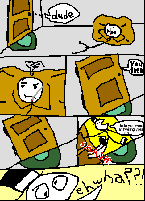
-the wider panel at the top establishes where the door is in relationship to our protagonist
-making the hinges on the door visible is a visual clue that the door swings inward. readers can pick up on this without consciously realizing it.
-consistent placement of nearby objects serve as visual reminders of what we're looking at
-similar panels where nothing is happening establish the passing of time- the more there are, the more pregnant the pause. (you can express a better feeling of the length of time with other cues, such as changing the hands on a clock, or inconsequential actions)
-motion lines give the impression of movement in static images, and the placement of the onomatopoeia indicates where the sound is emanating from
-keeping Alan's reaction and the reveal to what he's reacting to on separate pages creates a visual buffer, guarding the surprise from wandering eyes
my instinct would be expanding the first couple pages by maybe even 3 to 5 pages a piece. take some time to give readers a sense of the listless, sedimentary lifestyle Ryland lives in. Alan is an instigator that upsets Ryland's illusion of comfortable squalor, so I'd stretch to give readers a sense of just how go-nowhere Ryland's behavior is.
but, again, I'm not especially talented, so take this all with a grain of salt and do things the way you feel is best.
as for a hook... iunno.
the alarm clock thing actually works really well as an introduction to the character. the idea of Ryland setting an alarm, because he planned ahead to start practicing, then backing out of the plan and distracting himself with bullshit is great character study. very human.
my instinct, again, would be to expand. take a bit to establish that it's afternoon, take a bit to establish that somebody is sleeping at 2PM (which already tells us a lot about the character), then let him get woken up by the alarm. then he can get all petulant over his own self-imposed plans for self-improvement. (you might also want to experiment with ways to show his situation in the details- maybe a note on the calendar that says "practice today", or a lingering glance at the guitar, or an unopened training manual, or a regretful look before lighting up.)
Title: Looking For Feedback...
Post by: CandleJack on August 24, 2013, 07:22:30 PM
Post by: CandleJack on August 24, 2013, 07:22:30 PM
Quote from: BilliardBall10;1958465it is...surprisingly good.
i like the idea, the premise of a young kid who dreams to be a rock star, or a guitar expert, at the very least,
and he chills by smoking weed,a nd playing videogames.
the design is good, despite the black and white, and i must say, the art style reminds me off, a young calvin and hobbes.
with weed and nudity in it.
also, no offence but why do you show him with his dick all the time?
tho, the last panel, where you draw him with his backbones being visible, and his angry look while alan calls him.
nice anatomy for a cartoony character, and nice and clean expressions.
i like this comic. do more, and try to add more to the storyline.
your drawings are GOOD, but the story needs more.
good tips/advice, man!
also: could you show me THE CC WEBCOMIC that you did?
link me to this clock comix, dude!
ALSO: i recall action clock doing the ''lunch box'' a great comic about life, agents, and talking fruits.
-it also had indiana jones vs nazies-
i miss action-clock.
the site is long long gone. its sad.
Title: Looking For Feedback...
Post by: AMPM on August 24, 2013, 07:39:48 PM
Post by: AMPM on August 24, 2013, 07:39:48 PM
Quote from: Slurpee;1958560I'm probably not the best person to be doing this, honestly, because I'm really not very good at it, myself
)
Aaah my GOD all of that makes so much goddamn sense, yeah I will really take all that into consideration, thanks again so much for going over it more and making the mock up, really that helps a lot. thanks thanks thanks
Title: Looking For Feedback...
Post by: SpongeClock SquarePants on August 26, 2013, 03:43:02 PM
Post by: SpongeClock SquarePants on August 26, 2013, 03:43:02 PM
Basically all the stuff slurpee mentioned. I must also mention there is something really interesting about the style, something that kept me interested where the story failed to convince. The sample technique that slurpeedick described would really help out the flow and grab the readers attention. I think i once saw a good book on visual storytelling for comics etc. maybe it was this one : http://www.amazon.com/Understanding-Comics-The-Invisible-Art/dp/006097625X/ref=pd_sim_b_2
Title: Looking For Feedback...
Post by: BilliardBall10 on August 26, 2013, 05:26:02 PM
Post by: BilliardBall10 on August 26, 2013, 05:26:02 PM
Quote from: Slurpee;1958560you flatter me.you are very eloquent.
I'm probably not the best person to be doing this, honestly, because I'm really not very good at it, myself
but, since you asked, a mock-up of how I might rework a portion of it:
seriously.
also, i want to see more comics like this slurpee. i know you did this to explain some principles in comic art, but i found it hillarious. plz do more comics, man!
Quote from: CandleJack;1958561the site is long long gone. its sad.DUDE. i know that the site is probably dead, but:
do YOU have any copies/images saved in your PC, from your old comic ''Clock Comix''?
if so, link me to them via imageshack, or e-mail them to me.
you must have kept something out of this comic!
also, action-clocks ''lunchbox surprise'' was a great comic. i might post a few links/images.
AND:
brainsnail, your art is good, and you are really good, but man, you just have to add a bit more into the story.
i dont know, maybe add some more characters? add some backstory in the two protagonists, guitar dude, and alan, and how they first met, why dylan hates him, etc etc.
and show us some good change in the story, like a grand oportunity for them, like a chance to play for a big band's opening show, or a sudden contest for a reallity show(american idol, england you've got talent, sing your heart out, whatever), and show them trying to get the magic audition, to finally get some fame, and recognition.
or even, make a twist, and make them win an audition for a hollywood studio, despite them being singers, and not actors, it would be fun.
Title: Looking For Feedback...
Post by: AMPM on August 27, 2013, 05:44:38 PM
Post by: AMPM on August 27, 2013, 05:44:38 PM
http://inthenoweventually.com/post/59526985327 i'll just leave this here in case anyone has some more good advice
Title: Looking For Feedback...
Post by: BilliardBall10 on August 27, 2013, 06:30:25 PM
Post by: BilliardBall10 on August 27, 2013, 06:30:25 PM
i didnt understood the guy's catchline about ''it never did''.
what does it mean
what does it mean
Title: Looking For Feedback...
Post by: AMPM on August 27, 2013, 06:57:58 PM
Post by: AMPM on August 27, 2013, 06:57:58 PM
its cuz it never did
Title: Looking For Feedback...
Post by: pop-tart on August 27, 2013, 08:31:49 PM
Post by: pop-tart on August 27, 2013, 08:31:49 PM
NEVER???
Title: Looking For Feedback...
Post by: AMPM on August 27, 2013, 08:33:28 PM
Post by: AMPM on August 27, 2013, 08:33:28 PM
...
never
never
Title: Looking For Feedback...
Post by: BilliardBall10 on August 29, 2013, 06:10:01 PM
Post by: BilliardBall10 on August 29, 2013, 06:10:01 PM
i just read all the 22 pages.
it was very enjoyable, and i especially liked the driving lessons part, which was really funny.
i liked how you've drawn the driving instructor, and the whole ordeal.
was this inspired by a..personal experience?! ;)
i like where this is going, tho, you must add more stuff to the stories, like maybe soem more characters, maybe ryland's first love encounters, make him facing love,women, jealousy, drinking, driving, trips, responcibillities, plans for a music carreer, and some more mental battles with alan.
alan is like both his best friend, AND his worst enemy, right?
this comic visually reminds me of mafalda, but in a more violent, immature and adult enviroment.
http://en.wikipedia.org/wiki/Mafalda
also, in visuals, it does have a look like gardfield, but only a tiny bit.
for the most part the drawing style reminds me of mafalda, but still remains funny and original.
just evolve the story a bit more.
and maybe add more characters to it.
it was very enjoyable, and i especially liked the driving lessons part, which was really funny.
i liked how you've drawn the driving instructor, and the whole ordeal.
was this inspired by a..personal experience?! ;)
i like where this is going, tho, you must add more stuff to the stories, like maybe soem more characters, maybe ryland's first love encounters, make him facing love,women, jealousy, drinking, driving, trips, responcibillities, plans for a music carreer, and some more mental battles with alan.
alan is like both his best friend, AND his worst enemy, right?
this comic visually reminds me of mafalda, but in a more violent, immature and adult enviroment.
http://en.wikipedia.org/wiki/Mafalda
also, in visuals, it does have a look like gardfield, but only a tiny bit.
for the most part the drawing style reminds me of mafalda, but still remains funny and original.
just evolve the story a bit more.
and maybe add more characters to it.
Title: Looking For Feedback...
Post by: AMPM on August 29, 2013, 06:50:35 PM
Post by: AMPM on August 29, 2013, 06:50:35 PM
Thanks man, it's really nice to hear that you enjoyed it!
Also, yeah, it totally does look like that Mafalda, I hadn't seen that comic in a long ass time, though.
Also, yeah, it totally does look like that Mafalda, I hadn't seen that comic in a long ass time, though.
Title: Looking For Feedback...
Post by: AMPM on September 28, 2013, 01:54:33 PM
Post by: AMPM on September 28, 2013, 01:54:33 PM
http://inthenoweventually.thecomicseries.com/comics/30/
Hey here is more of the comic, I've been working on a rough copy of a story board so this is really hard to read, but as you look through it keep in mind this is when looking it over. Here's a guide to look at as you read through
Page 1 - We see an alarm clock constantly waking and nagging Ryland who then gets up after knocking it off it's mantle.
page 2 - Ryland decides not to look at the time because it might distress him, and he soon passes out again, and falls over. now annoyed he's determined to look at the time, seeing that it's 3 pm
page 3 - it seems that didn't have any more of a motivating effect. he lies down on the ground moaning, as the looks over at his guitar, and his calender, we can see he hasn't touched the thing in a year, and begrudges himself for it
page 4 - We see him making an attempt to play the guitar, but he really doesn't know HOW to play it, so he ends racking on the thing until a string breaks in his eye
page 5 - ryland sneaks out of his room to get smokes
page 6 - ryland gets a talking to from his mother about not smoking, ryland says, WELL WHAT IF I WASNT HERE WHAT IF MOVED OUT, to which his mother says, she thinks that'd be great but its a lot of work, it's a big responsibility. ryland blows her off and gets back to his room and has a drink. he says 'if im not inspired to play, then i simply CANT play...nope, not inspired!'
page 7 -ryland gets a text from his friend alan who says he's off of work and wants to hang out, ryland tosses the phone and ignores the message, but alan comes by and enters ryland's room anyway
Hey here is more of the comic, I've been working on a rough copy of a story board so this is really hard to read, but as you look through it keep in mind this is when looking it over. Here's a guide to look at as you read through
Page 1 - We see an alarm clock constantly waking and nagging Ryland who then gets up after knocking it off it's mantle.
page 2 - Ryland decides not to look at the time because it might distress him, and he soon passes out again, and falls over. now annoyed he's determined to look at the time, seeing that it's 3 pm
page 3 - it seems that didn't have any more of a motivating effect. he lies down on the ground moaning, as the looks over at his guitar, and his calender, we can see he hasn't touched the thing in a year, and begrudges himself for it
page 4 - We see him making an attempt to play the guitar, but he really doesn't know HOW to play it, so he ends racking on the thing until a string breaks in his eye
page 5 - ryland sneaks out of his room to get smokes
page 6 - ryland gets a talking to from his mother about not smoking, ryland says, WELL WHAT IF I WASNT HERE WHAT IF MOVED OUT, to which his mother says, she thinks that'd be great but its a lot of work, it's a big responsibility. ryland blows her off and gets back to his room and has a drink. he says 'if im not inspired to play, then i simply CANT play...nope, not inspired!'
page 7 -ryland gets a text from his friend alan who says he's off of work and wants to hang out, ryland tosses the phone and ignores the message, but alan comes by and enters ryland's room anyway
Title: Looking For Feedback...
Post by: AMPM on September 28, 2013, 04:59:29 PM
Post by: AMPM on September 28, 2013, 04:59:29 PM
This here is Lotusclock's awesome interpretation, this is an alternate version he made so I could study different means to tell the story and a different vision of the character and their motivations to see if it is more effective
I'm really curious as to what you guys think of the differences and which one works better, although I KNOW that his art is much better.
http://files.myfrogbag.com/mp4ldh/ampm_eventually1.JPG
http://files.myfrogbag.com/mp4ldh/ampm_eventually2.JPG
http://files.myfrogbag.com/mp4ldh/ampm_eventually3.JPG
http://files.myfrogbag.com/mp4ldh/ampm_eventually4.JPG
http://files.myfrogbag.com/mp4ldh/ampm_eventually5.JPG
http://files.myfrogbag.com/mp4ldh/ampm_eventually6.JPG
http://files.myfrogbag.com/mp4ldh/ampm_eventually7.JPG
I'm really curious as to what you guys think of the differences and which one works better, although I KNOW that his art is much better.
http://files.myfrogbag.com/mp4ldh/ampm_eventually1.JPG
http://files.myfrogbag.com/mp4ldh/ampm_eventually2.JPG
http://files.myfrogbag.com/mp4ldh/ampm_eventually3.JPG
http://files.myfrogbag.com/mp4ldh/ampm_eventually4.JPG
http://files.myfrogbag.com/mp4ldh/ampm_eventually5.JPG
http://files.myfrogbag.com/mp4ldh/ampm_eventually6.JPG
http://files.myfrogbag.com/mp4ldh/ampm_eventually7.JPG